18. Refresh on ROC Curves
ROC Curves
If you'd like to refresh your memory on ROC curves, check out the below video from Luis.
ROC Curve
The curves have been introduced as follows, where in the horizontal axis we plot the True Positive Rate, and in the vertical axis we plot the False Positive Rate.
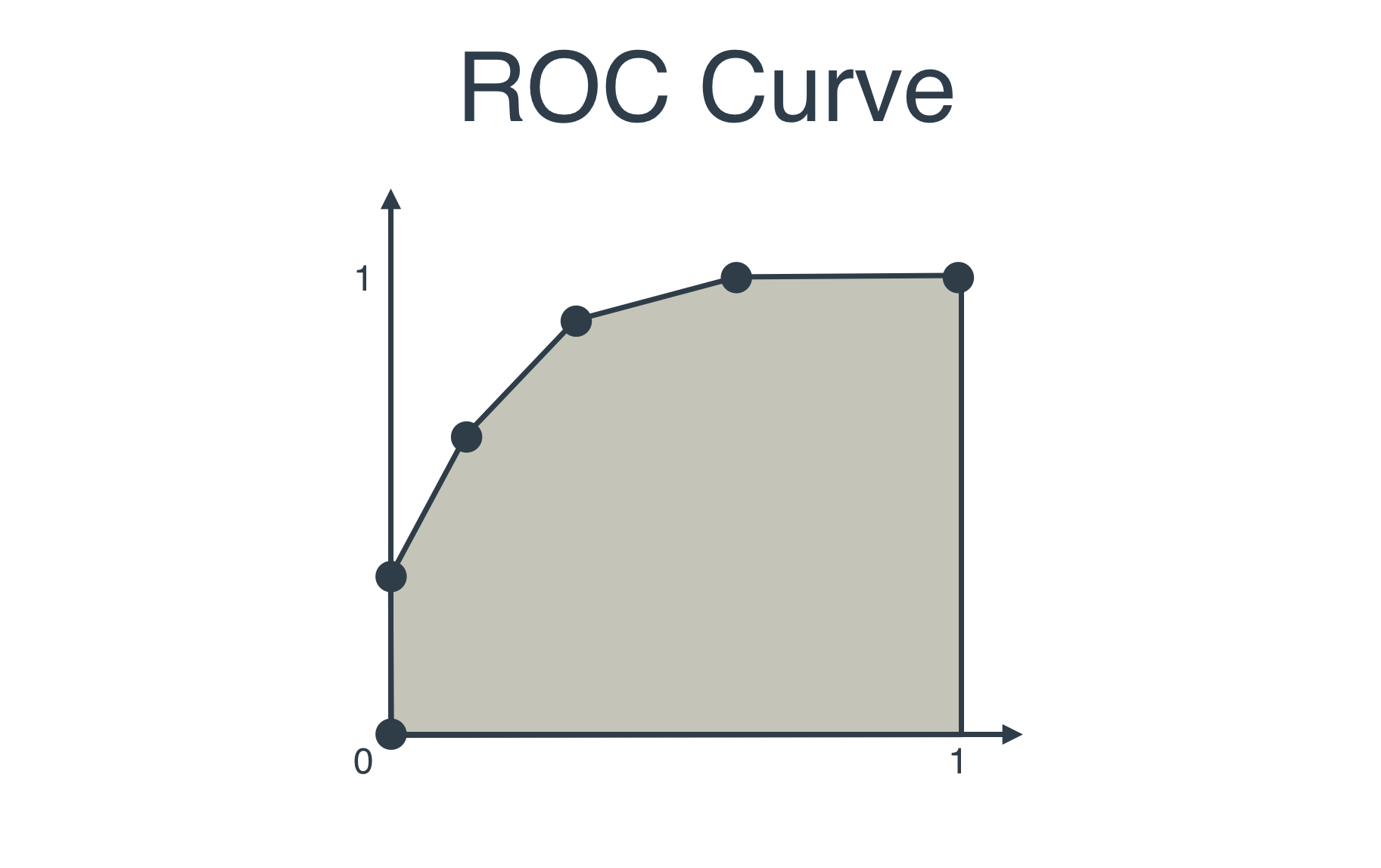
However, you'll see that in this section, I will use a different ROC Curve. The one I use looks like I flipped it sideways, like this:
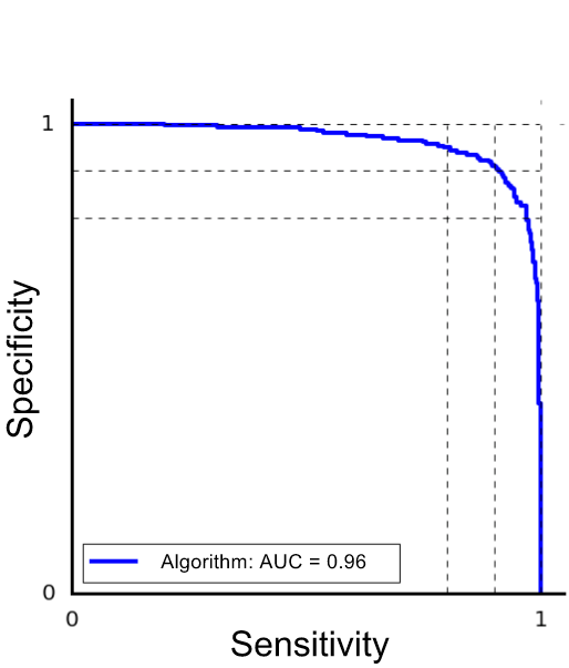
And there's a really cool reason why I use this one. And it's because it's the curve we get when we plot the sensitivity in the horizontal axis, and the specificity in the vertical axis!
Let me be more specific (yes pun intended). Let's use the same histogram as in the last section.
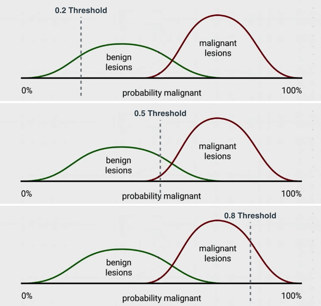
Recall that the values in the horizontal axis are all the possible thresholds. For any threshold p between 0 and 1, the verdict of the model will be the following: "Any lesion to the left of this threshold will be considered benign, and any lesion to the right of this threshold will be considered malignant, and sent for more tests."
Now, for this particular model, we calculate the sensitivity and specificity as follows:
- Sensitivity: Out of all the malignant lesions, what percentage are to the right of the threshold (correctly classified)?
- Specificity: Out of all the benign lesions, what percentage are to the left of the threshold (correctly classified)?
And we plot that point, where the coordinates are (Sensitivity, Specificity). If we plot all the points corresponding to each of the possible thresholds between 0% and 100%, we'll get the ROC curve that I drew above. Therefore, we can also refer to the ROC curve as the Sensitivity-Specificity Curve.
And finally, here's a little animation of the ROC curve getting drawn, as the threshold moves from 0 to 1.
Images